My brother started his own company and I created the brand identity, here is my process
After more than a decade working for my dad’s company, my brother recently started his own business and he asked me if I would design his logo and business cards
2017 / March 05 / 11:30 AM / Ottawa, ON
It seems the Martensen family is starting to develop an entrepreneurial streak. My dad created and runs a construction company that he’s built up for over a decade. My mom teaches her own classes, speaks at conferences, and does freelance work as a professional Doula. Now my brother, Ryan, has caught the bug and several months ago he dove head-first into his own venture, Lake Park Construction Inc.
When Ryan asked me to design his logo and business cards it was a no-brainer, I said yes and we got right into it. We spoke at length about his plans for the company, what he envisions the brand being in 3 to 5 years, what the business values were and how he wanted to position himself in the market.
I was taking notes during our conversation, and one of the things I like to do is take note of specific words that I hear repeated by the client. When people are trying to express a vision they have of something in their head, they inevitably end up repeating the words their brain associates the most with that idea. I believe if you can get an understanding of what those specific words mean to the client—not what they mean to you or to the general public—you can get the best understanding of what the client is looking for in the final product.
Two of the words I heard repeated by Ryan were ‘hand-crafted’ and ‘traditional’, so I put lots of weight into those words when I evaluated the visual impact and feeling the logo creates.
When I sat down to start on the logo I filled a page or two with hand sketches of different looks but I already had a good idea of what I wanted to do, and I narrowed down the options fairly quickly before settling on one.
It’s the one you see at the top of this article. Remember the part about understanding the client’s vision? Spoiler: I have a good relationship with my brother and didn’t have a hard time understanding what he was looking for.
It’s not always easy to understand your clients, but when it is those clients can end up being your most valuable clients and you should put in the effort to build on those relationships.
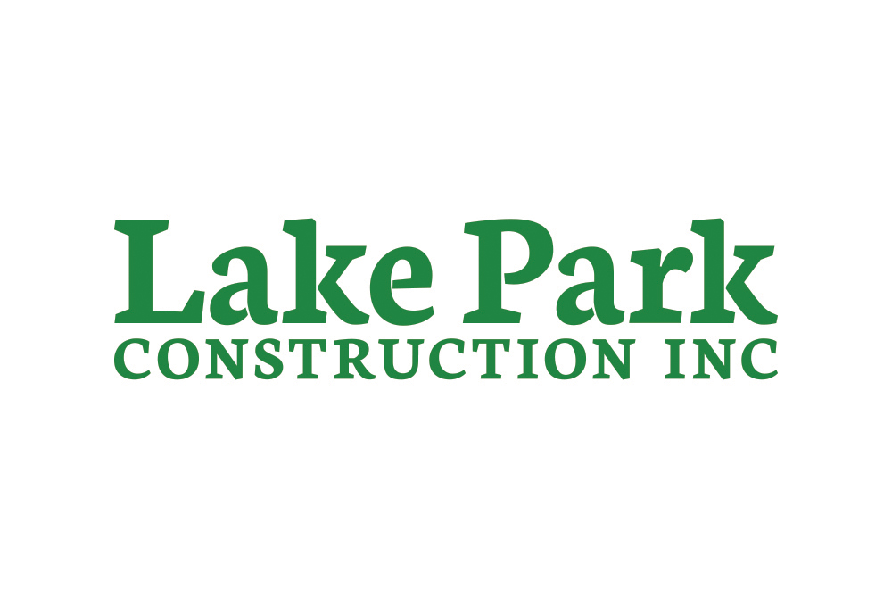
Lake Park Construction logo type
After narrowing down the rough concepts for a logo more often than not I will start with the typography, but ultimately it varies depending specifically on the concept. This time I did start with the type, and being that this concept did not involve hand lettering (eg. this Leanwords logo I did), I opened Adobe Illustrator and laid out the company name in lowercase, title case, and all caps text.
I will then scroll through fonts of one or two specific types, which types depend on the concept and in this case I knew I wanted a slab serif font. Every time I find one I like enough to seriously consider, taking into account every potential use I can think of, I copy the text and build a list off to the side until I feel confident that the list is comprehensive. I narrow it down from there.
There were several fonts I really liked for the Lake Park logo, but when it came down to it there was a clear winner, the OFL font Neuton.
In the Neuton font the capital P does not fully connect, as you see in the final Lake Park logo. To me the gap made the letter look like it was put together by hand—coughhandcraftedcough—in addition to the visual of a river flowing into a lake, the lake being the counterform in the bowl of the P.
I also felt the tilt to the slab serif in the font added a certain visual impact—coughhandcraftedcough—that would align with what we were looking for in the final product.
I liked the gap in the capital P so much that after settling on title case for the words Lake Park I added gaps to the two lowercase a forms and the lowercase e to give them the same look. The two lowercase k forms already had a gap like you see in the logo, but I did adjust the distance between the pieces.
I should mention that before I do any altering of letter forms I will lay out the final type construction and play with spacing and size. Kerning, tracking, and leading are important parts of any good logo typography.
I tightented up the kerning a couple places in the words Lake Park from Neuton’s default (specifically the optical default kerning and not metric), decreased the tracking a few points, and basically halved the space between the two words.
I went with all caps for the word construction, chose a much smaller size, and upped the tracking until the width of the word matched the width of Lake Park.
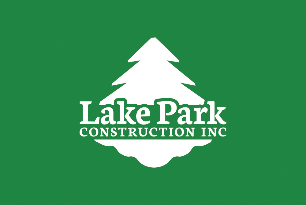
Once the typography is complete, I save that as a standalone piece and complete the rest of the form of the concept. In this case a tree above the type and a lake below. Lake Park. Simple. Traditional. Part of Lake Park’s mission is to be as eco-friendly as possible by recycling materials, etc. Couple that with the words lake and park, a tree and a lake is just… practical. Your logo doesn’t need layers of hidden meanings to be a good logo, but it does have to have an appropriate meaning, and that’s what a tree and a lake give an eco-friendly brand with the name Lake Park.
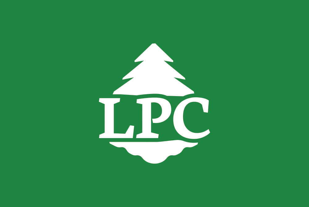
Lake Park Construction logo crest for small sizes
The forms I started with were regular old triangles. I placed one above the type and a shorter, inverted triangle below the type. I then created smaller triangles which I evenly spaced along the side edges and then cut out of both larger triangles to create the branches of the tree and the ripples or waves in the water.
I then spent a not-short amount of time playing around with the size, angles, and forms of the branches and waves. The branches specifically went through several rounds of straight lines, curved lines, short branches, steep branches, and more until I settled on the final shape. The shape I settled on was inspired by the tilted serifs you see in the typography.
The waves did not take as long to nail down being that they pretty much had to be smooth curved lines to achieve the right look. The contrast between the smooth ripples of the lake and the sharp angles of the tree is a big reason I settled on the forms you see in the logo.
From there I extended the bottom of the tree downwards behind the type and punched out the gap that contours the top of the words Lake Park. I saved that piece as the main logo form, and replaced the text with the LPC initals, modified that contoured gap between the text and the shapes, and saved that as the crest. The crest is the third, or alternate logo that is to be used mainly at smaller sizes when the full text would be too small to read.
Last thing I had to do was find a colour. I went with the eco-friendly theme and spent some time finding the right shade of green and the right shade of brown. I put all three logos together—the type, the full form, and the crest—into two PDF files, one set in green and one set in brown, and sent them off to my brother.
Ryan got back to me pretty quick. He chose green and said it was good to go, and that was that. Well, that’s almost true. He did approve the logos, but he also said, "It doesn’t have the ‘Inc.’ Gotta add the incorporated to the name. Makes it legit!" So I added ‘INC’ and sent it back. Now it was good to go.
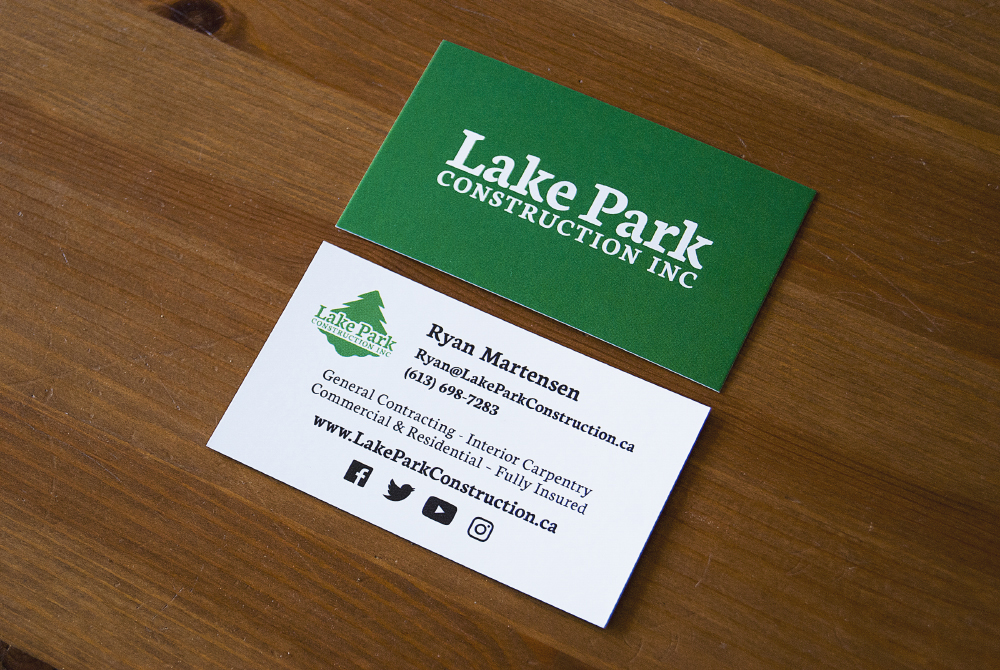
Lake Park Construction business cards
The business card is a much shorter story. I got the copy from Ryan and tried a few basic layouts, (right justified, everything centered, nothing crazy) chose the one pictured, tweaked the sizing and spacing a little bit, and that, too, was that.
One note I can make is that I went with the type-only logo on the back because the width-height ratio fits the landscape orientation of the card, and the full-form logo on the front fits nicely into that square space without being too small—and as a result having to use the crest.
Again, having a good relationship with my brother and being able to understand what he was looking for is a big reason this process was so smooth, and you can’t expect every client to approve your first submission, but hopefully I was able to provide value in this article through insight into my branding process.
—James
